


20 feet
10 feet
Autumn 2024
10 week visual design project
My role: UX Researcher, UX Designer, Visual Designer
Tools: Figma
Research
Competitive analysis
Personas
User Journey
Through user research I aimed to better understand food festivals and what makes them successful and I hoped to answer the research question.
How can I create a festival that excites ALL University of Washington students and creates community within groups who exist within different social circles?

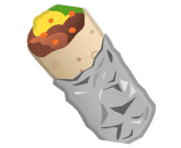
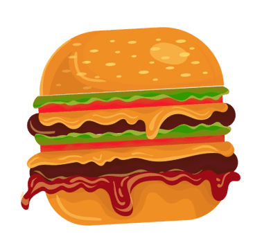
Sprout is a three day college food festival that meets students where they are, providing culinary education, community building activities and fun for stressed and malnourished college kids. For UW students who are feeling uninspired by the same dining hall meals and microwaved creations, this festival provides an opportunity for students to try new foods, learn new techniques, and delight their senses with exciting competitions and challenges.
Unlike other food festivals, my festival is limited to only college students. There are so many things that college aged kids don’t have access to and they are constantly being told “no” this festival is a chance for them to let loose and enjoy something that is just for them.

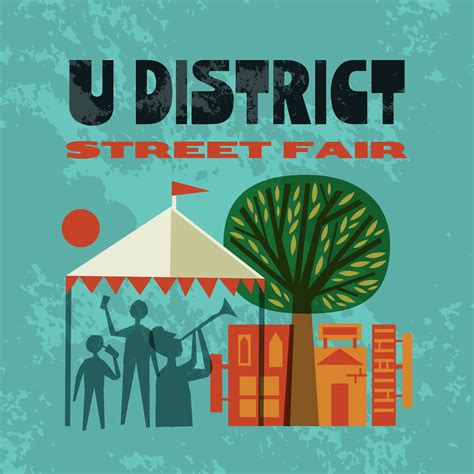
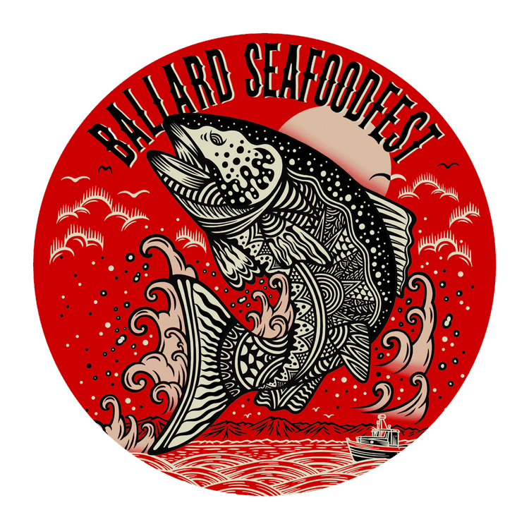
Competitive Analysis
There are so many food festivals that already exist and it is hard to create something new in a space where events have been hosted for decades.
In order for Sprout Festival to stand out I needed to gain an understanding of what makes existing food festivals successful and where they may fall short.
To do this I researched three local food festivals and analyzed what makes them, THEM!
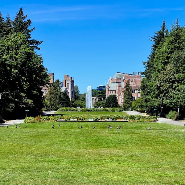
Project Overview
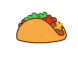
Sprout is an idea for a three day college food festival that meets students where they are, providing culinary education, community building activities, and fun for stressed and malnourished college kids. For UW students who feel uninspired by the same dining hall meals and microwaved creations, this festival provides an opportunity for students to try new foods, learn new techniques, and delight their senses with fun competitions and challenges.
Unlike other food festivals, my festival is limited to only college students. There are so many things that college aged kids don't have access to and they are constantly being rejected. This festival is a chance for them to let loose and enjoy something that is just for them.
Insights
My research provided me with key insights about food festivals.
Providing a variety of hands on activities is imperative to keep guests entertained and happy.
High prices and long lines hurt the perception of the festival even if the food is amazing. College students especially really value time and money because both are very limited for them.
Personas
Best Feature
Easy access for college students and close to light rail.
Live chef demonstrations.
Festi-Bowl skate board events, and Lutefish Eating Contest.
25% of student discount on food trucks, interactive events and competitions.
UW students looking for a fun time and community.
University of Washington students
40,000 attendees
Free admission
Prices vary by vendor
Student discounts on meals.
Art appreciating students and U District community members.
Foodies who want unique dishes.
Families with young kids.
Members of the U-District community, lots of college students.
Food loving members of Seattle community.
All-ages families and Ballard community members.
50,000 attendees
450,000 attendees
70,000 attendees
Free admission
Prices vary by vendor
Free admission
Prices vary by vendor (people say it is too expensive)
Free admission
Prices vary by vendor
Best For
Customer
Attendance
Pricing
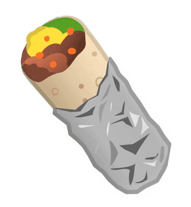
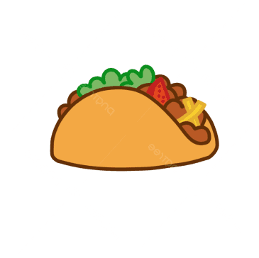
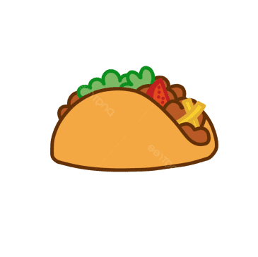
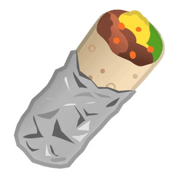
U District Street Fair
Bite of Seattle
Ballard Seafood Festival
Sprout College Food Festival
The University of Washington student body is made up of almost 40,000 diverse individuals. To better understand these individuals I created three personas.
I chose these personas because:
Around 10% of UW students are involved in Greek Life. Reducing separation from this group with the rest of student body could be beneficial for these students.
Many UW students describe themselves as “alternative”. Finding a way to appeal and seem cool to those who don’t necessarily frequent school events.
International students make up around 15% of the student body. Culture and food are highly correlated, providing a way to share and embrace culture through food is a key goal of the Sprout Festival.
I created personas with demographics and interests to get a better understanding of the people that will interact with this festival. This type of information will be incredibly helpful from a marketing standpoint.
Their needs and goals were something I wanted to understand to guide my design decisions.
In reflection I would have loved to have completed character archetypes and information needs of users rather than focusing on specific demographics.
Examples of User Archetypes insights would be:
skills with using ticketing software
current technology students use to adapt into mobile app design
pain points that hold users back from to interacting with new events.


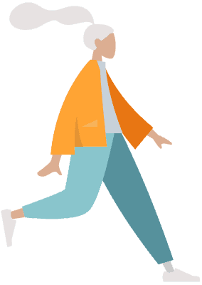
The Sorority Girl
The Shy International Student
Name: Jun
Age: 18
Backstory:
International student from Japan.
Very shy and struggling to make friends at UW.
Prioritizes academic success.
Emotions:
Lonely and homesick at UW.
Scared to approach people to be friends and lacking opportunities to be social while being busy with school.
Goal:
Find a friend that has similar interests that will study with her.
Too Cool For School
Name: Natalie
Age: 21
Backstory:
Pre-medicine student
Involved in Delta Gamma sorority
Loves to party, hang out with friends and meet new people.
Emotions:
Excited to have a fun event on campus revolving around one of her favorite things, FOOD.
She feels isolated from non greek-life students and wants to see what all of UW has to offer.
Goal:
Eat a food she never gets to try. The DG chef is great but is a bit repetitive with the meals.
Name: Nate
Age: 21
Backstory:
Amateur DJ who loves to thrift, skate, and go to punk concerts.
Describes his style as “grunge”
Trying to get ripped but struggles to hit his protein goal.
Emotions:
Values his public perception over everything, wants people to think he is cool and mysterious.
Desperate for attention, wants his DJ career to take off and gain traction.
Goal:
Have a lit DJ performance and learn about optimal dorm nutrition for gains.
Customer Journey
Persona
The Shy International Student - Jun
Social anxiety and shyness is very common among college students and in order to address their needs they must be understood.
The international student experience is unique and provides extra challenges to be addressed in the festival design.
Insights
Students are busy with other obligations, festival scheduling must fit around school schedule.
Follow up work needed especially by participating clubs to retain new members.
Language and cultural inclusion is important to make people feel seen.
The conclusion of research left me with an understanding of the current market for festivals. If I had more time for this phase I would have liked to conduct interviews to gain a better understanding of the potential audience to learn what real people prioritize. I also would have done user archetypes to understand their information needs at a deeper level.
Pain Points
What is not working or causing friction?
Cultural barrier
Gets overwhelmed in crowded spaces that are not welcoming.
Has been anxious at big events in the past
feeling hopeless that her people just aren’t at UW.
It starts on Friday and she gets out of class at 5:20, hopes it is still active
has a test Monday so must study during weekend.
Doesnt know if people are genuinely wanting to be friends or if they are excited to be in the atmosphere
Stress inclusivity in marketing.
Highlight activities before the event to avoid decision fatigue and allow guests to plan.
Actions
What actions is the customer taking?
Awareness
Consideration
Purchase
Post-Purchase
Touch Points
Through what medium is the customer interacting?
Goals
What is the customer trying to achieve?
Opportunity
How might you address the pain point through
better design?
Emotions
How is the customer feeling? What are they thinking?
feeling isolated at UW
Researching clubs but overwhelmed
trying restaurants on ave but they don’t hit quite right.
UW websites
Posters
find community through culture
make friends
lonely and getting hopeless
very homesick
Thinking: “I just want to find a community that understands me”
missed club fair bc scared to go
says she will try club meetings
mostly stays in dorm
frequents UW club website but is too shy to go to meetings
Yelp
Just wants a community of friends.
Go to an event and feel welcome, not be anxious.
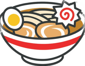
Eat some ramen that reminds her of home.
jealous of ig friends who look to be having a great time
anxious about attending a big uw event
Plan through event to avoid large crowds
have spaces for peace in case people get overwhelmed.
(Festival attendance is free)
Decides to go the night before
Goes in with attitude that she will try to make a friend
has received UW emails
seen posters all over
even her parents in Japan brought it up bc they received an email.
join an club
make a friend
no anxiety attack
eat good food
Feeling: anxious but excited
Thinking: “this better be as good as the marketing says it is”
Highlight event times with large font so it is clear.
Include a clear map so students know exactly where to go for events.
Not scheduled during finals or crazy midterm week.
Goes to festival after class
Looks at map first and goes to Japanese clubs first
asks table about ramen, makes a friend!
Looks at app to plan schedule
Goes to Ramen Cook off
Eats at food truck
Tables have signs posted saying which languages they speak.
Emphasis on connection on social media
Friendship encouraged by layout and activities
Hopes to join club after festival
Continue friendship with people she met
Feeling grateful for getting out of her comfort zone
happy to have found likeminded people at UW
Design
Wordmark
Mood Board
Colors
Typography
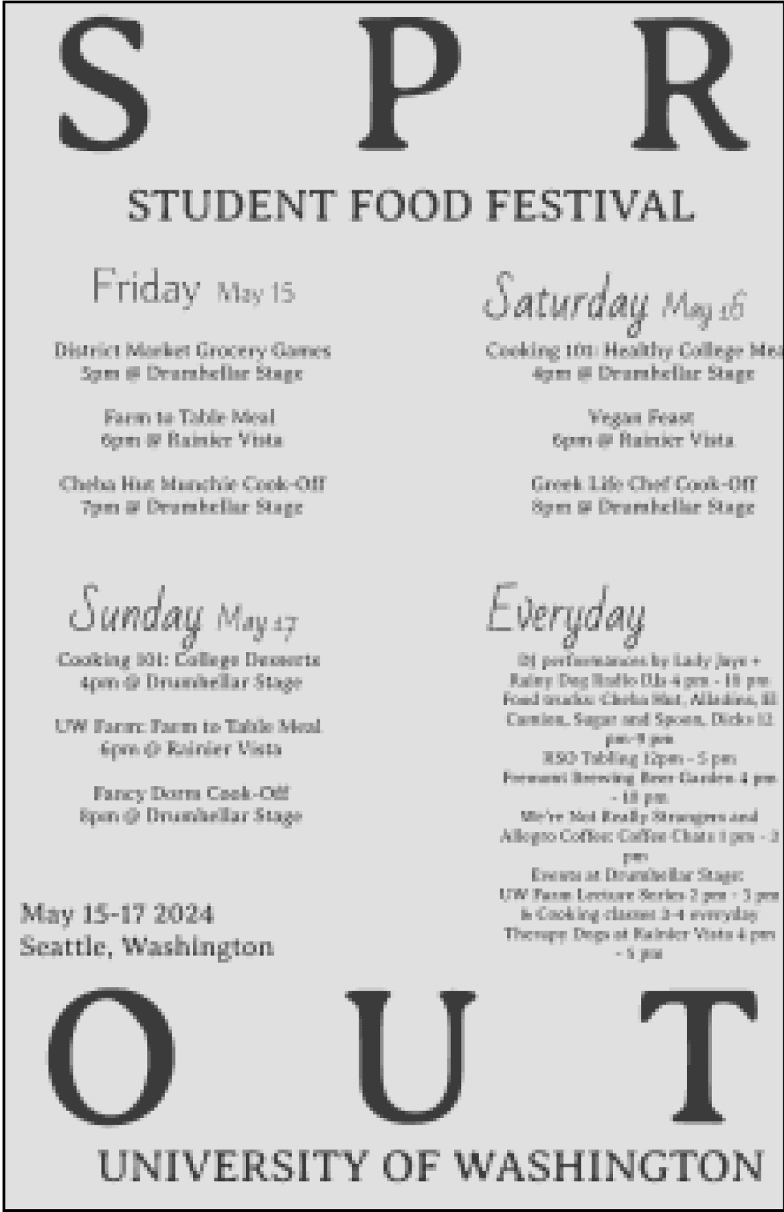
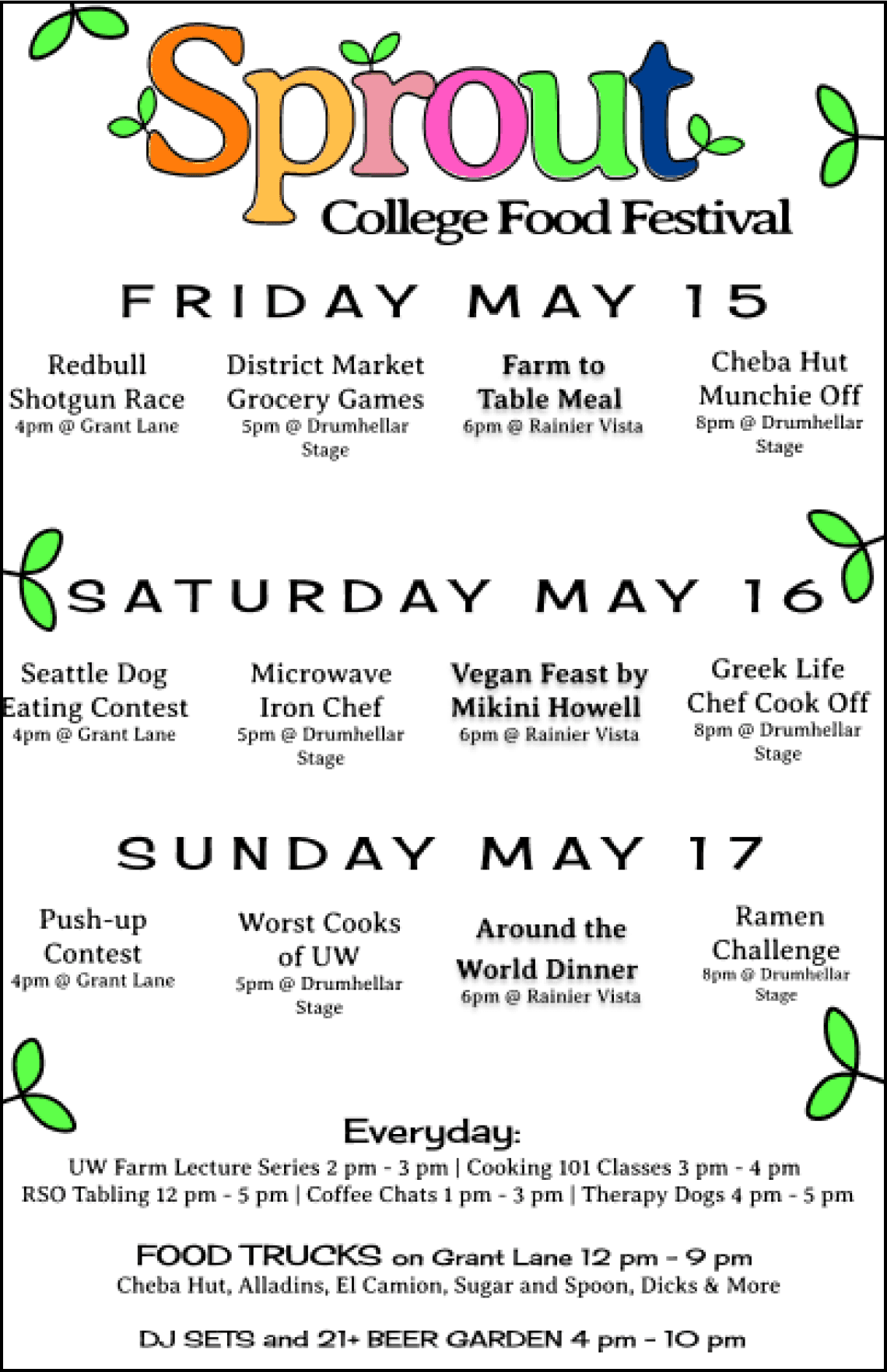
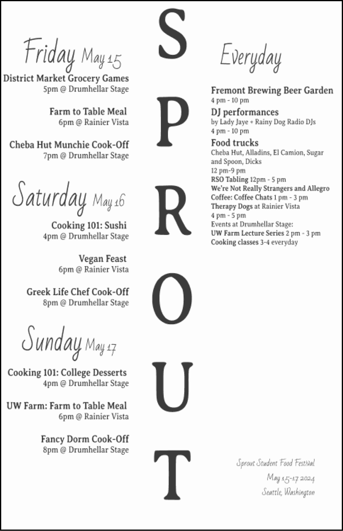
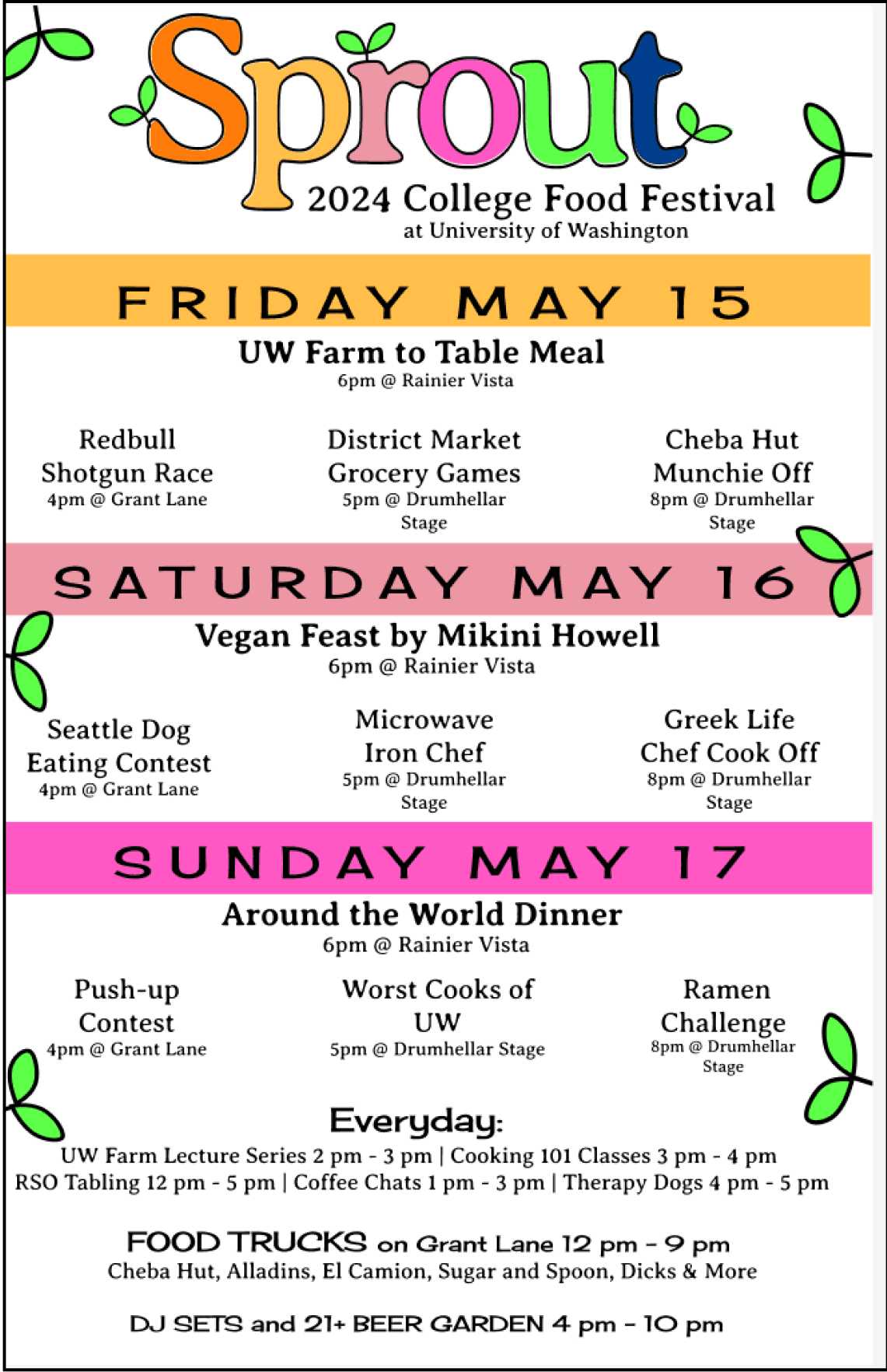
Poster
Signage
Map
I designed each of the visual elements of this festival with the consideration of my research to bring Sprout festival to life. I hoped to create designs that had a playful, energetic, and youthful energy that conveys the goal of the festival to let college kids enjoy themselves and feel connected to the stage of life they are in. I did this through bright colors, nostalgic imagery, and typography choices.
Mobile Interface
User Flow
Wireframes
User Testing
Symbols
Protoype
The final step of the project was to create a prototype of mobile app for the Sprout festival. Implementing all of the research insights and designs from earlier in the quarter, creating this app helped to bring Sprout to life.
Wordmark
Mood Board
Colors
Festival Poster
Signage
Map
User Flow
User Testing Discoveries
Wireframes and User Testing
Symbols
Prototype
Takeaways
Earlier Iterations
Typography

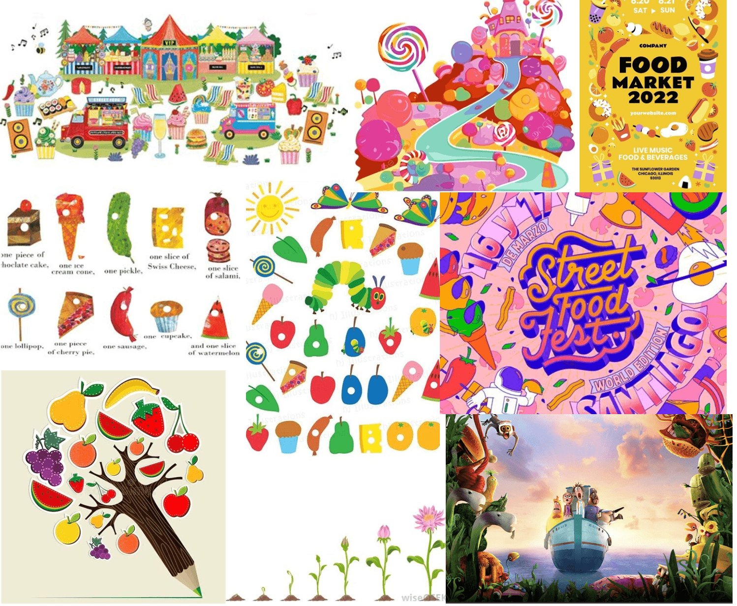
I took inspiration from nostalgic food-focused media such as Cloudy with a Chance of Meatballs, The Very Hungry Caterpillar, and Candyland. Sprout is focused on having fun with food and growing up, using elements such as colors and themes from these help convey the youthful energy of the festival.
The theme of most of my inspiration pictures is busy and colorful. My color palate was highly influenced by the mood board. The bright pinks, greens, and blues provide a sense of youth and energy which I hope my festival also gives its guests.
I wanted to convey a feeling of brightness, nostalgia, and fun.
To accomplish this, I chose a square color palette, which features navy, yellow, pink, various shades of green, grey, and orange. This scheme has classic colors that are bright which help to create a playful palette. These colors will also be perfect to display different types of food which is important for my festival.
Contrast Accessibility
Tertiary
Secondary
Primary
Color: Hot Pink
FF57C4
Color: Gold Yellow
FFC04A
Color: Blush Pink
EF97A5
Color: Neon Green
5EFF4A
Color: Blue
64A8FF
Color: Navy
003E8F
Color: Green
9AC19A
Color: Orange
FF7C0A
Color: Gray
61646B
Contrast Ratio 4.63 : 1
Contrast Ratio 4.62 : 1

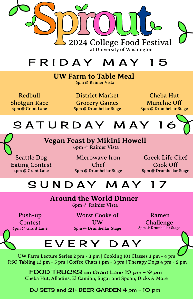
For my poster I used my wordmark font Averia Serif Libre, as my primary font, and Cherry Cream Soda as a secondary font to display each day of the festival.
Each day of the festival is in uppercase letters and a larger font size to place emphasis on the dates of the festival.
The highlighted events for each day are bolded and centered to display their importance and catch the viewer’s eye before other events.
I used different colorful backgrounds from my color palette for each day to create a visually appealing and eye catching design and keep with the playful theme of my festival.
I included earlier iterations of my poster to show how this project helped me to grow as a designer. The frist two iterations were my designs around week four of this project. I think it is clear to see how much better the final poster and even later iterations are in terms of type hierarchy, readability, and the use of space. Designing this festival was one of my first times using Figma, and over the quarter I grew in my ability to use that tool to design. I am excited to see the improvement my design skills will get as I continue to experiment with Figma.
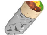
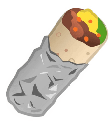
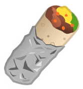
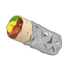
I designed a freestanding primary sign to display Sprout's dates and location. Its goal is to advertise the festival to students walking around campus.
This sign conveys the youthful vibe of the festival and is heavily inspired by The Very Hungry Caterpillar by Eric Carle. I hope people will see it and will be and feel a sense of nostalgia and excitement for the festival.
This will be a very large sign, standing 20 feet horizontally and 10 feet vertically. Festival goers can use this as a photo back drop.


One of the most challenging design tasks in this process was creating a map of the festival. This tested my skills in Figma and attention to detail and was tedious but I am proud of how it turned out.
The tan color represents roads and walkways, the buildings are pink, and festival events are navy blue so they are the most eye catching.
I set the direction using a symbol of a mountain to represent Mount Rainier. UW students will be able to gain directionality from this landmark.
Early Iterations:
To the right are earlier iterations to show my design process. One major change was switching the background from green to white. This was to ensure the map was accessible to those with colorblindness.

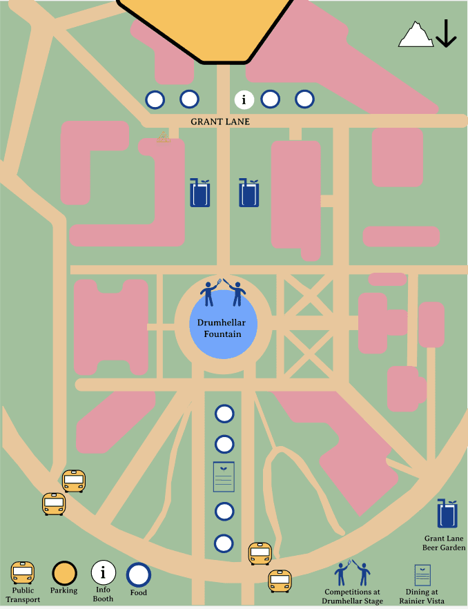
parking
I chose the persona Jun for my user flow because she is very busy with school so finding time to attend events will be the most challenging for her.
I chose the task of planning a schedule and allowing Jun to customize her schedule by favoriting events, and adding them to the schedule at times that work for her.
Insights:
Merging schedule page with Google Calendar will help students balance festival events with other responsibilities.
Many app pages are required to provide users with information about all of the events. Finding a way to provide all necessary information in a minimalistic way is important.
Login Page
Schedule Page
Meal Series Reservation Page
Meal Series Reservation Page
Home Page
Home Page
Click “schedule”
Click “schedule”
Connect with Google Calendar
Add personal info: username, create password
Fill in user/pass
explore events
Add to favorites
Add to schedule
Reserve spot
Sort by type
add to schedule
Start
Start
No
No
Yes
Yes
sprout meal series
Click “favorites”
food trucks
tabling events
competitions
beer garden page
Schedule Page
Login Page
Calendar Updated
No account
End
Scroll through days and see events.
Screen
Interaction
Start
Yes
No
User
Decision
Key
Early wireframes of the Sprout mobile app were similar to the final product but key changes were made after user testing to make it a more functional and user-friendly application.
I conducted a multiple user tests with other HCDE students to gain insights on changes to make to improve the usability of my interface.
I asked the questions:
At first glance, what do you think is the main task for this design?
Are there challenges in creating a festival schedule[process to complete the task]?
If you could change one thing about the product, what would it be and why?
Add "save event" page
Do more with less
Maximalist design and maximum efficiency does not mean cluttered pages
All features do not need to be on one page
Users prefer minimal efficient design, such as only showing one day per screen on the "personalized festival schedule" page
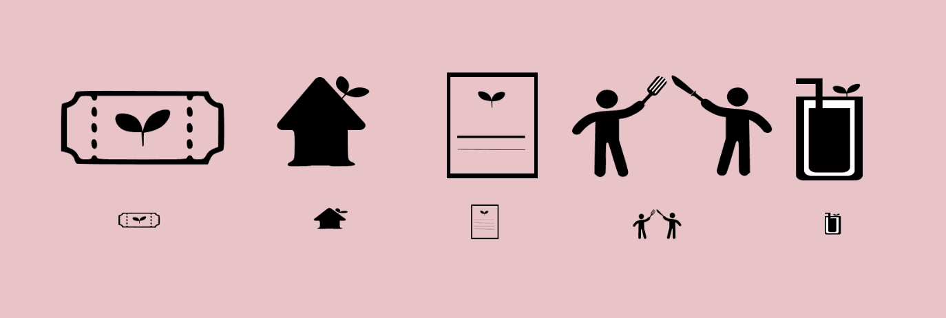
I chose five icons; tickets, home, menu, competitions, and drinks.
To relate the symbols to my logomark I used the serif of my word mark font as a base for my symbols.
The home icon base, leaf stem, and utensils all have this element creating a cohesive theme among the symbols. I also utilized the sprout symbol in some of the icons to further connect them to the logomark.
This project taught me everything I know about the design process, Figma, and myself as a UX designer thus far. I grew so much in my ability to create designs and concepts, my confidence in my skills, and ability to communicate ideas through design.
Throughout this project I shared my progress with peers, did weekly critiques, and reflected on the process. This allowed me to work on my professional skills of public speaking, comfortability with criticism, managing deadlines, and communicating design decisions effectively.

Healthy Cooking 101 3 pm

My prototype focus is on creating a festival schedule.
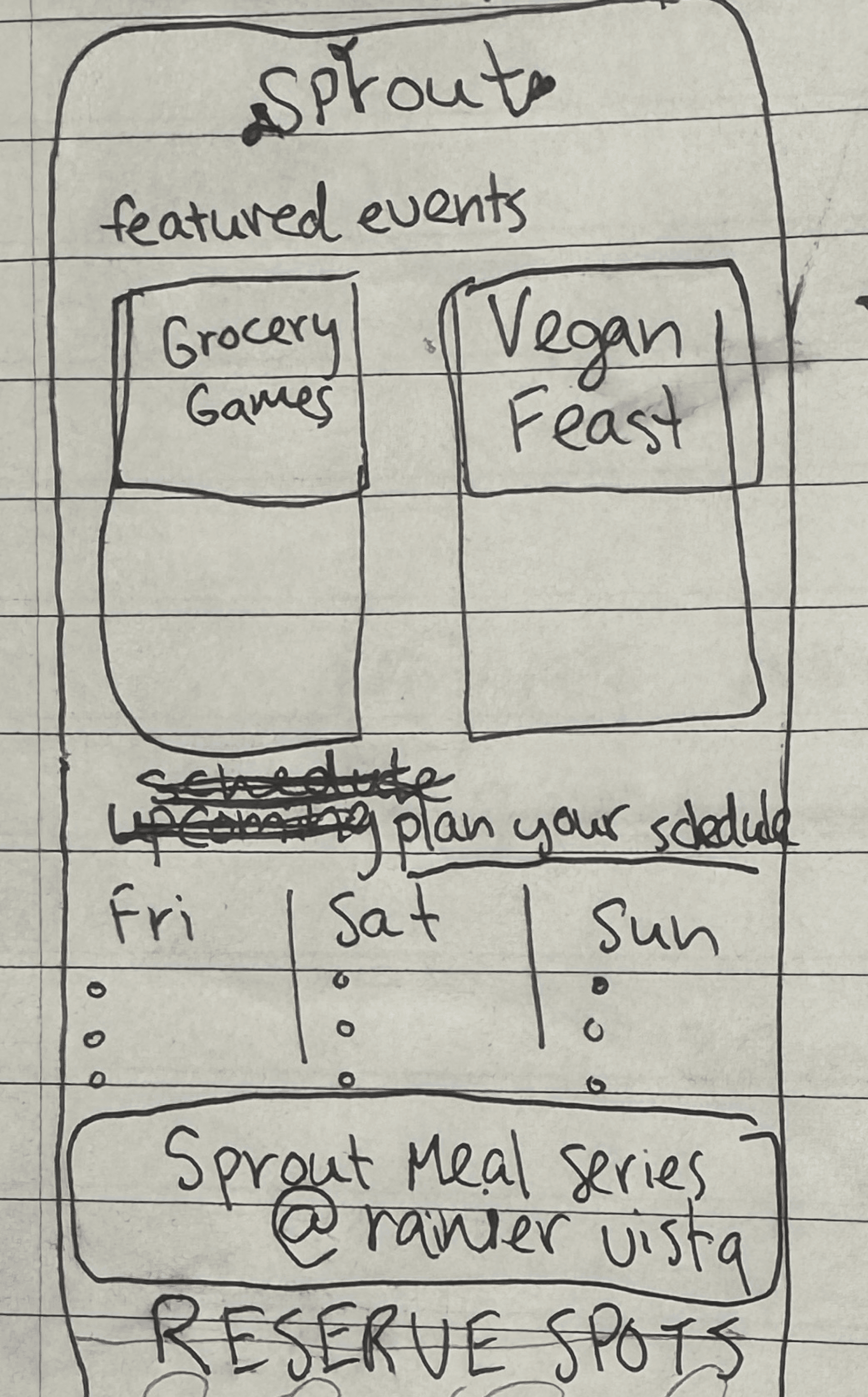
Home Page
Color coded links provide information about each category of activity, and “A Taste Of” highlights featured events.
These events have a heart symbol that allows users to add the event to their “saved” list.
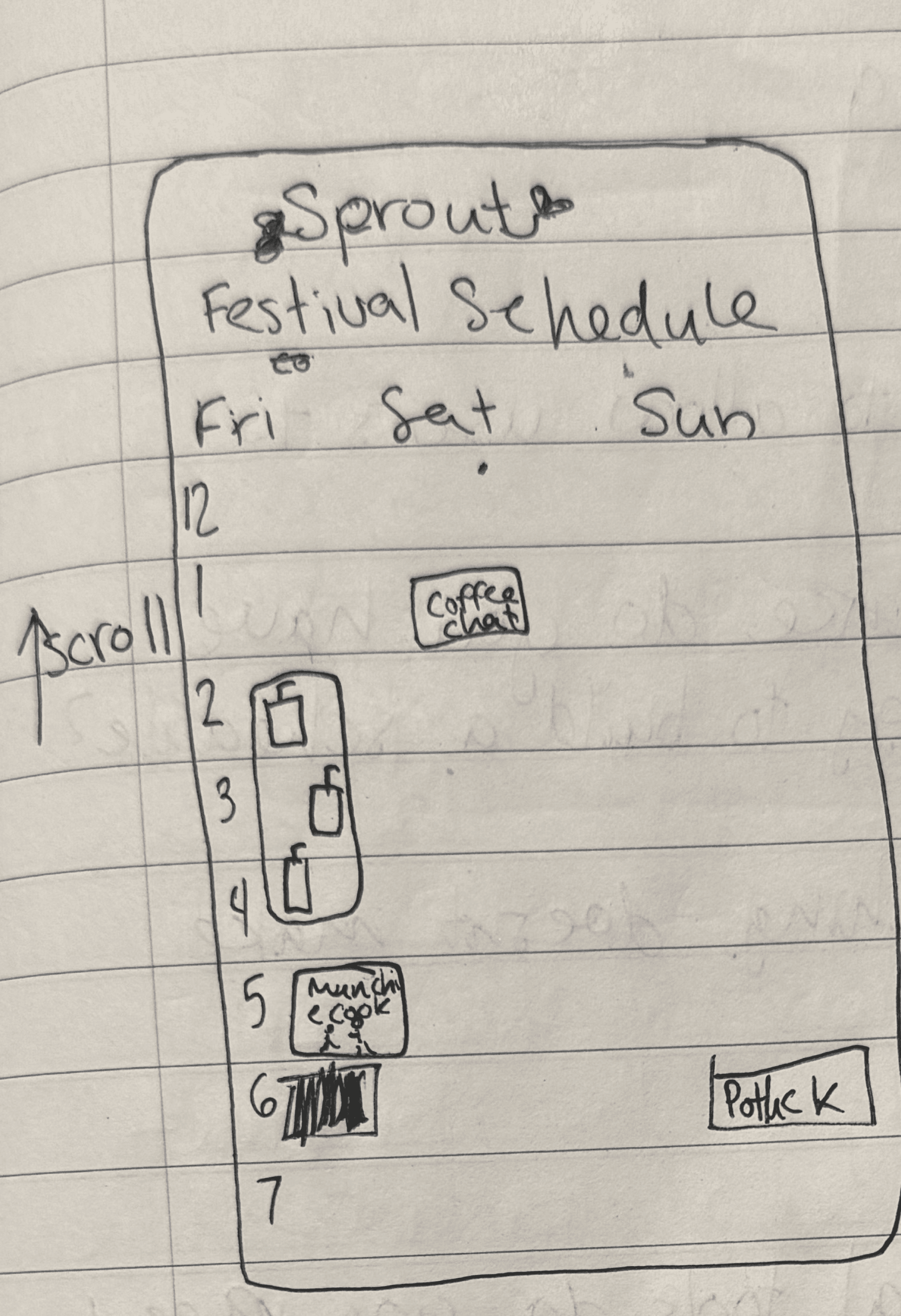
Personalized Festival Schedule
I added a feature that would allow a user to connect their Google Calendar to the schedule. Since my festival is targeted towards college students, it is important to make sure that events fit in with their personal schedule.
Festival Map
My festival map is incorporated into the mobile app. Each symbol is clickable and navigates to pages describing each category of event. This allows users to see the locations of the events and get their bearings at the festival.
Sprout Meal Series
Each day of the festival has a unique meal in which guests reserve a spot for. To reserve a spot users click on one of the plates which display the number of spots left, I thought this was a good way to incoperate my design and creativity into a function of the app.
Cravings
When a user “hearts” an event it is automatically added to their saved events page.These events are able to be sorted by day, type of activity, and the level of “hype” surrounding the events. From this page users can add to their schedule.
Insight
People complaining it is too expensive, too long of lines, and disorganized.
Limited activities to draw in guests for longer periods of time.
Activities for all ages promote better culture.
Variety of conveniently timed events can provide a study break and discounts make new foods accessible on a budget.